


"Sayanmoloko" is a dynamically developing enterprise located in the Republic of Khakassia. More than twenty-five years of experience in the production of agro-industrial products makes the holding unique for Siberia and the Far East.
Task
Sayanmoloko approached us to create a brand of dairy products that would be able to present the unique qualities of the Siberian region in large stores of federal chains. It was necessary to develop the brand positioning, define its meanings, design the product packaging, and reflect this in the brand book.
Solution
Defining brand meanings is a fundamental step in the process of developing a brand strategy, including communication with the target audience. The Getbrand team's work began with building a brand platform.
Defining brand meanings is a fundamental step in the process of developing a brand strategy, including communication with the target audience. The Getbrand team's work began with building a brand platform.
Despite the fact that Sayanmoloko's regional brands already enjoyed a certain popularity among consumers, we realized that a federal brand could not be a continuation of them.
"Shirokaya dusha" (Wide soul) is a brand that represents a large part of the country, to which the residents are so reverent - the very center of Siberia. Ecologically clean region, beautiful expanses, powerful Sayano-Shushenskaya HPP and other significant attractions of the region - all the listed characteristics are as accurately formulated as possible in the resulting brand essence: "Products with Siberian soul, which we are proud of".
"Shirokaya dusha" (Wide soul) is a brand that represents a large part of the country, to which the residents are so reverent - the very center of Siberia. Ecologically clean region, beautiful expanses, powerful Sayano-Shushenskaya HPP and other significant attractions of the region - all the listed characteristics are as accurately formulated as possible in the resulting brand essence: "Products with Siberian soul, which we are proud of".
The developed mission of the brand: "To create high-quality products with soul and love, glorifying by our labor our business, our native land and people who surround us" - perfectly translates the main values of the company, namely - reliability of the product, conscientious labor and love for our native land. The brand "Shirokay dusha" represents the image of a confident, caring and concerned person, as if we were talking about the brand as a person.
The logo opens wide on the product packaging, like a Siberian soul that wants to enclose in its embrace. Brown color, which is not typical for dairy products design, gives a reference to the rich nature of the region and will undoubtedly stand out pleasantly against the background of competitors. Mountains densely covered with taiga forest, snowy peaks - these images remind of the main beauty of Siberia.
The latter is also reflected in the expressive foodzone of the packaging, which emphasizes that this is not just a dairy product, but a dairy product produced in the taiga lands. The predominance of blue and green colors also draws the buyer's attention to the natural origin.
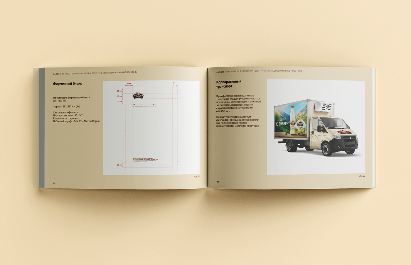
The brandbook prescribes the rules of using the logo, fonts, all important components of corporate identity, which will undoubtedly help to develop the corporate brand of the company.
We hope that these products will appear on the shelves more and more often to please us.


